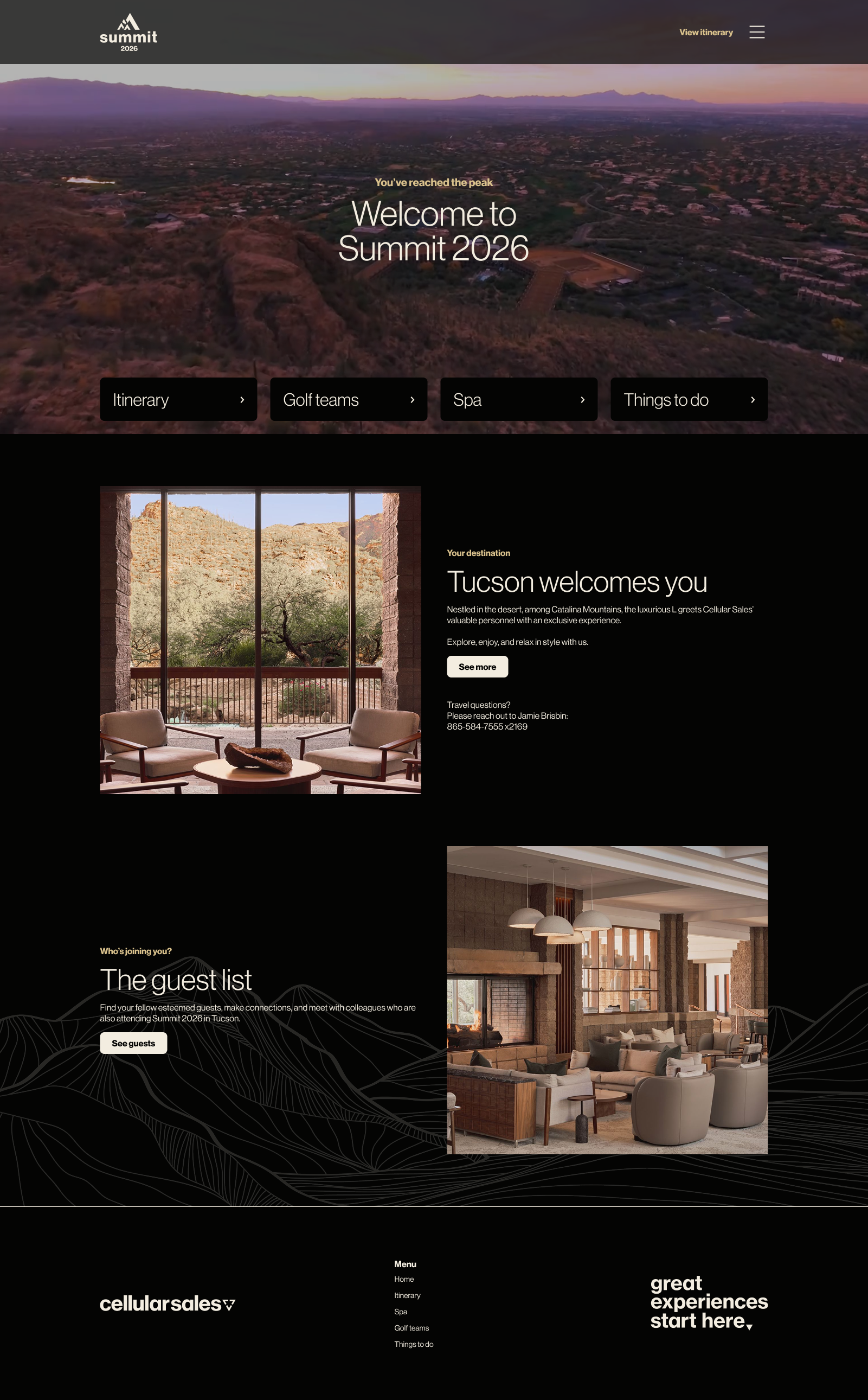
RP Summit Website 2026
I, alongside another UX designer and a copywriter, was tasked with creating a website for a company event held in Tucson, Arizona. The premise would be that this would be an exclusive event and the company needed a place to consolidate all the important information about the event in one place. Working with my fellow creatives, we crafted a design that suited the mood and would be easy to access both before and during the event’s duration.
Designed with Desktop and Mobile in mind
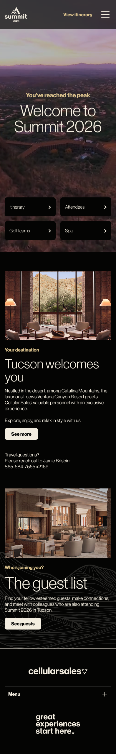
The creative brief established early on that it would be important that this site be both desktop and mobile friendly. Most people were likely to open the initial invite to the site on their laptops, but during the event the site would regularly be accessed via mobile devices. In Figma, I designed layouts that suited all screen sizes, ranging from phones to tablets to laptops.

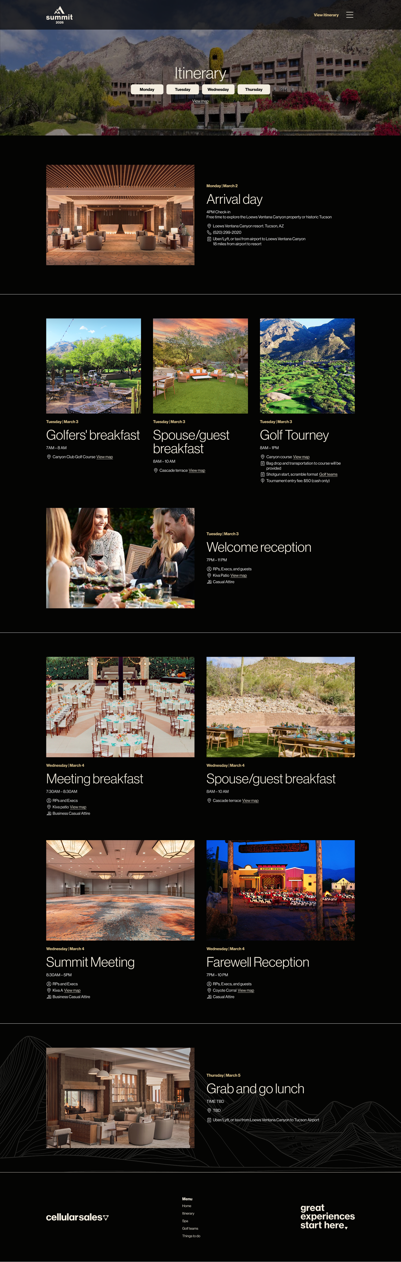
Easy to access Itinerary page
The itinerary page held the highest priority for the site as it would be the central location in which all information pertaining to when and where events would be happening during the summit. This page was the first to be designed after the homepage and features several anchor buttons that would bring the user down the page to quickly see what’s on the itinerary for the given day. A custom-designed map of the property highlighting points of interest was also included on this page, so users could see where the event rooms were located.
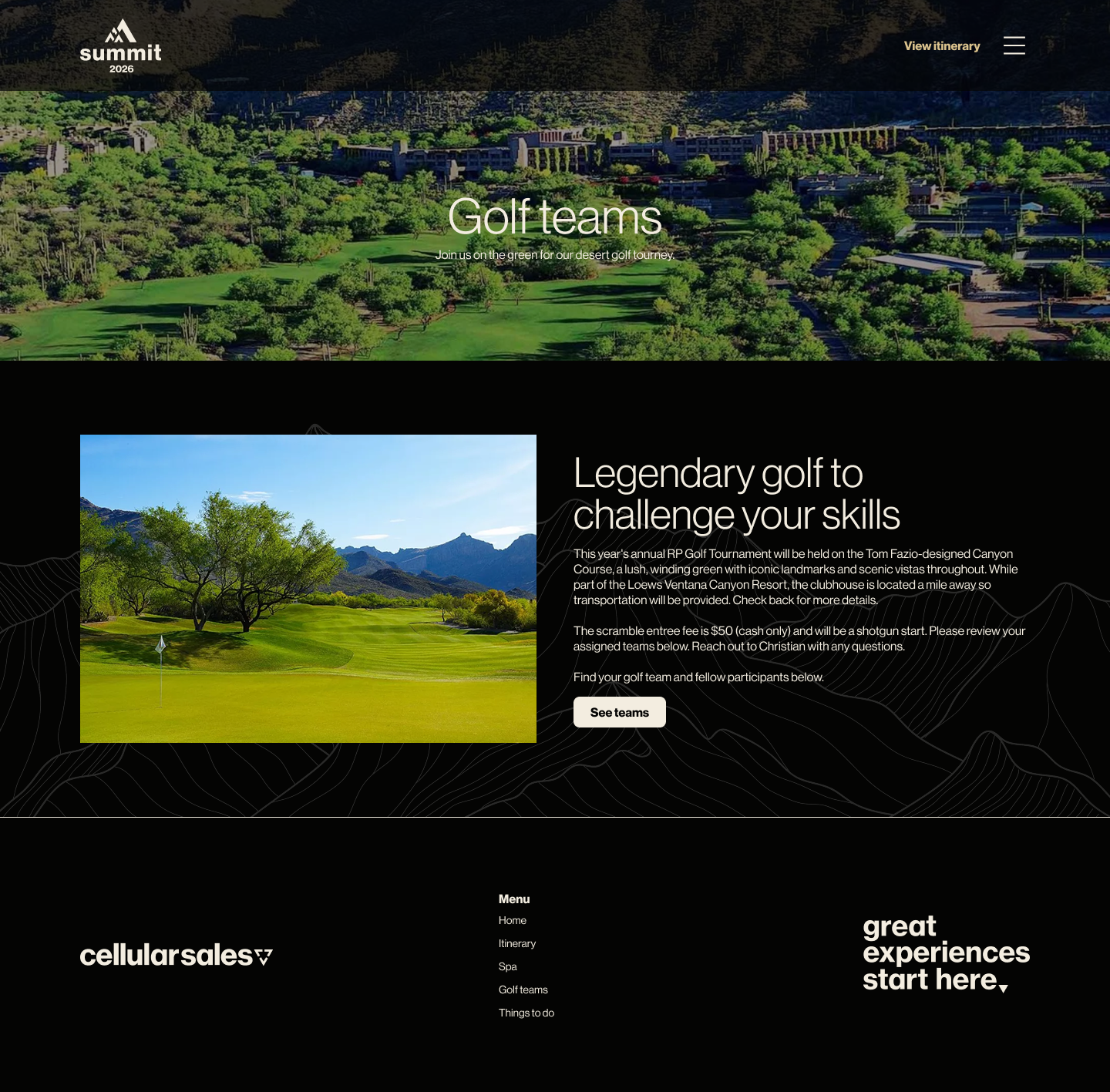
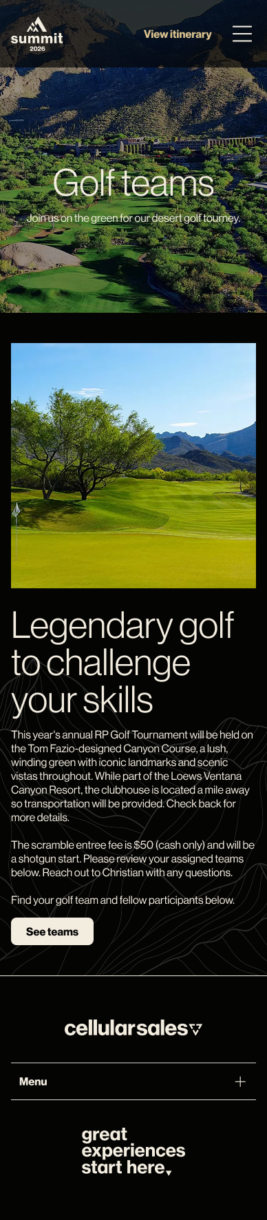
Next up, The Golf Page
This page went through several iterations with the clients that requested this site. Initially, a carousel was designed that could be periodically updated with the golf teams that were participating in the event. The client found the tool used to update this carousel cumbersome to use, so it was tasked with the designers to come up with an alternative option. The button would instead link offsite to a form that would more easily be updated by the clients.
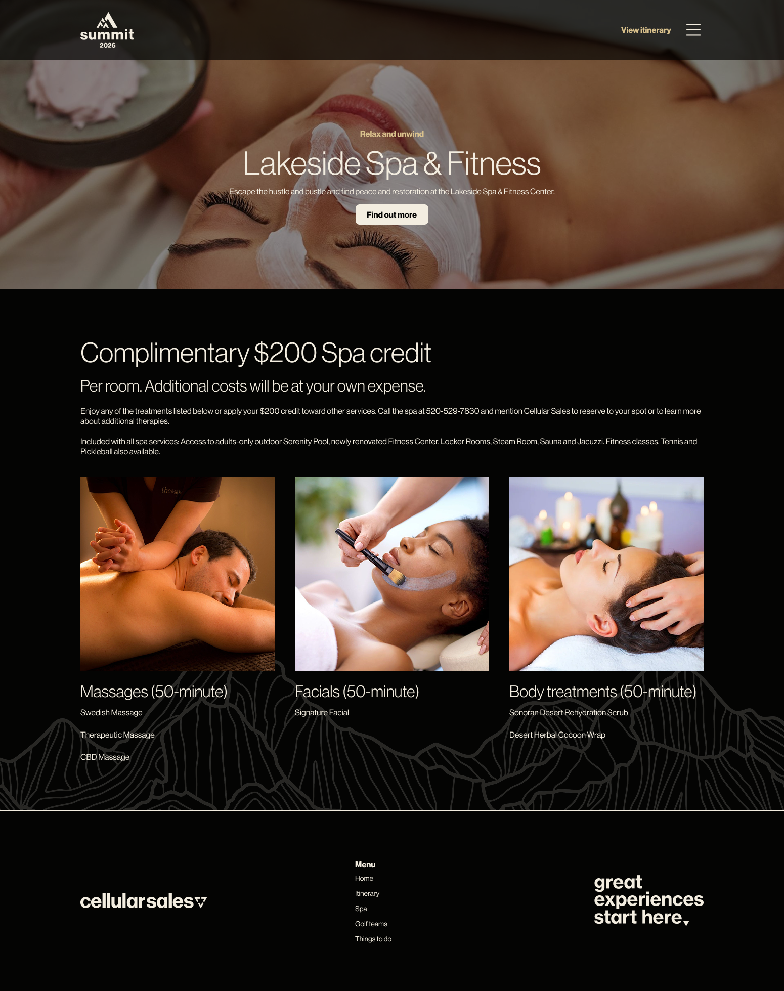
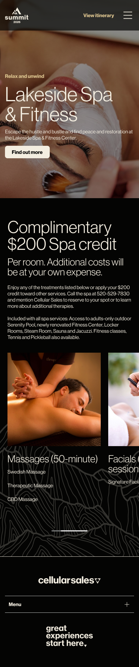
A straightforward Spa Page
The premise of the spa page was simple: make guests aware of the complimentary spa credit and what options are available to them. Only one module was necessary on this page, with it being a scrollable module on mobile.
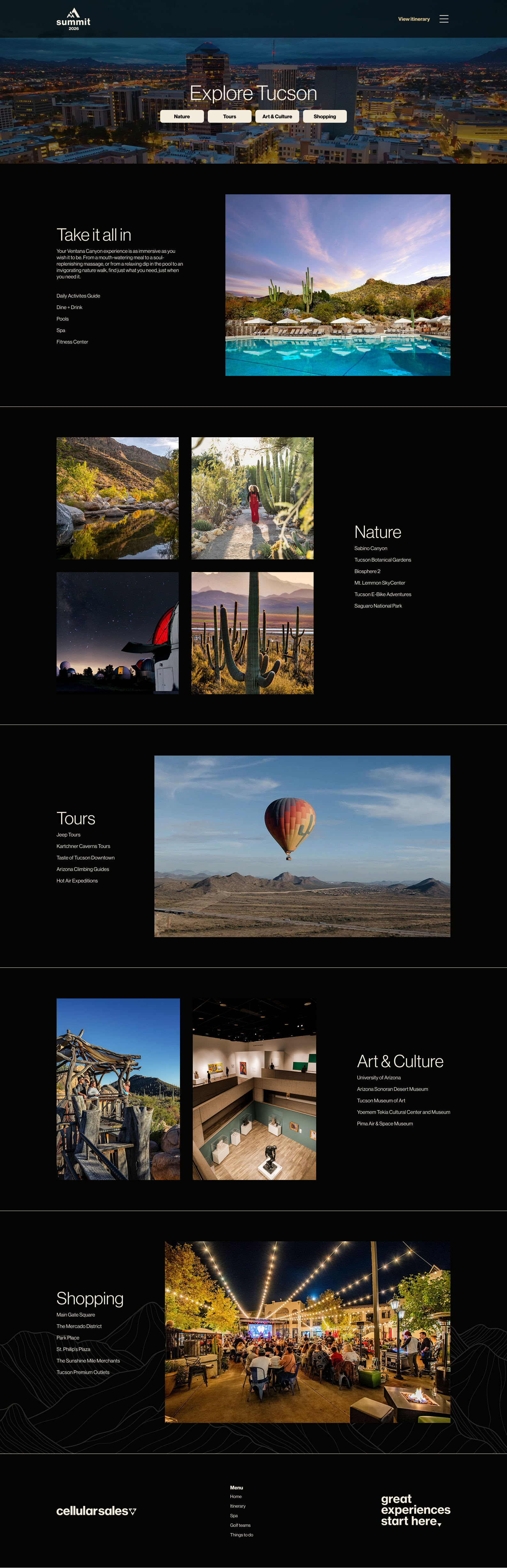
Finally, a destination page
Internally, this page was called the “things-to-do” page and in the final product it conveyed just that. The client requested a page that would let guests know about all the local opportunities around the city of Tucson. I reused the anchor buttons from the itinerary page, so users could quickly scroll down the page to the category that was most interesting to them. Each category featured links that would direct users to relevant webpages offsite with more information.